Home decor can be a stressful thing. After all, it’s not every day that you get a chance to refurbish your house, and the fear of making a mistake holds us back. Lack of knowledge about what patterns and colors go together and what shapes and sizes you should choose can lead to those design mistakes. Learning a little bit about decor first would be a good strategy.
Your home is your favorite place, your rest and respite, and your adventure ground. Its appearance should match your personality and style first and foremost.
Contents
- 1 Choose Your Favorite Color Palettes
- 2 Start With A Central Focal Piece
- 3 The Classic Motif – White + One
- 4 Geometric Patterns Are Resplendent
- 5 Go With A Simple Background When Using Large Textures
- 6 Be Consistent With A Pattern Style
- 7 Be Consistent With Color
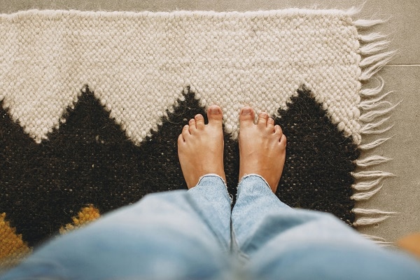
- 8 Make A Large Rug The Highlight Of The Room
- 9 Try Bold Patterns And Colors
- 10 Layering Rugs
- 11 Conclusion
Choose Your Favorite Color Palettes

It’s your house, and you’ll live in it, so before worrying about patterns, decide what colors you want. Choose warmer tones or colder tones of that color. You should have at least two main colors in your selection, plus one bright one to give the room a pop of color here and there.
Start With A Central Focal Piece
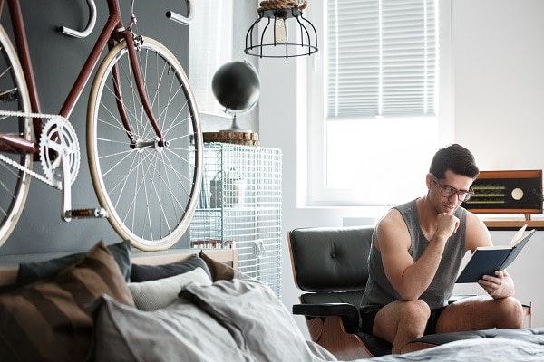
One way to start with decorating is with a central piece. It can be a painting, a favorite sculpture, a piece of furniture, or a plant. Choose patterns that exemplify that piece or complement it in color and style, and then select your furniture, drapery, and fabrics to go with the theme.
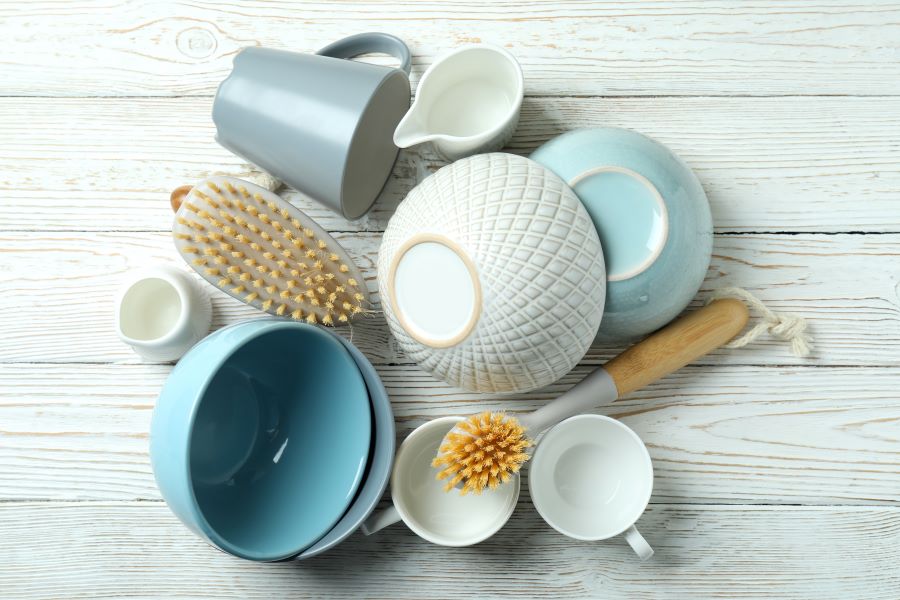
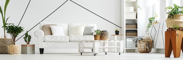
The Classic Motif – White + One

Mix a white base with a colored pattern to achieve a simple, minimalistic, and neat look. White goes along well with most colors, so there are fewer chances of clashing colors. You can use stripes, polka dots, or more intricate patterned pillows and curtains.
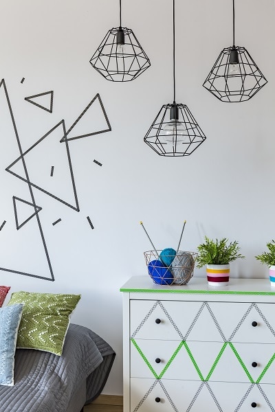
Geometric Patterns Are Resplendent
Geometric shapes can really transform a space and make it handsome and chic. Pick patterns with triangles, circles, zig-zag lines, and curves. Ground the room with two bigger patterns and then embellish with several small ones. Geometric patterns work particularly well with monochrome themes and smaller spaces.
Go With A Simple Background When Using Large Textures
It can be risky playing with bold and larger prints, but you can do it successfully, and once it’s done, it looks absolutely grand. Begin with neutral tones for wallpaper and flooring, add the key parts of furniture or a rug with the large prints, and pepper some more neutral color chairs, paintings, or sofas to complete the decor.
Be Consistent With A Pattern Style

Carrying out a similar pattern throughout is an effective and proven method to good decor. It helps maintain flow and continuity. You can change out the colors, shapes, and sizes of the pattern to give more divergence.
Be Consistent With Color

The opposite of the above method works well too. Choose one color, two at max, and varying patterns in wallpaper, drapes, curtains, and furniture. The similar colors throughout provide cohesion, and the difference in the pattern makes the place vibrant and lively.
Make A Large Rug The Highlight Of The Room

The main pattern and prominent color should be the rug. This anchors the space aesthetically. Put in different and similar patterned pillows and chairs to frame a rich visual landscape.
Try Bold Patterns And Colors

Pastel colors look nice but can get boring sometimes. Don’t shy away from bold, vibrant patterns; they can enhance the living space and make it vivacious. Go with dramatic wallpapers paired with deep neutral tones. For smaller prints on furniture, choose monochromatic ones so that they don’t clash with the louder, more colorful ones.
Layering Rugs
Layer different patterned rugs to create contrast between those patterns and a unique texture to the room. Make sure the pattern stands out on its own, and go along together as well. Use a larger rug with lighter shades and a smaller one on top with darker colors to focus the visuals.
Conclusion
Once you learn the basic rules of decor, you can go wild with them. You can even throw them out the window. But it’s important to know them so you can employ them cleverly and eventually create your own rules.