Color plays a vital role in interior design, influencing both the aesthetics and the mood of a space. While some colors can enhance the ambiance, others may have unintended effects. Common misconceptions about color choices often lead to mistakes that can affect the comfort and appeal of a home. This post is here to shed light on specific colors that may not be suitable for various rooms in your home, guiding you toward choices that resonate with your lifestyle and preferences.
Contents
How Color Affects Your Mood
Color is more than a visual element; it has a profound impact on human emotions and psychology. Different colors can evoke various feelings and moods, influencing how a space is perceived and experienced. For example, blues and greens are often associated with calmness and serenity, while reds and oranges may stimulate energy and excitement. Understanding the psychological effects of color is essential in interior design, as it allows for the creation of spaces that align with the desired ambiance and function.
The influence of color on mood is not merely subjective; scientific studies have explored the connection between color and emotional response. Lighter shades tend to promote feelings of openness and relaxation, while darker colors can create a sense of coziness or, in some cases, confinement. The intensity and saturation of a color also play a role, with bright, bold hues often energizing a space, and muted tones providing a more soothing effect. Even the direction of a room and the natural light it receives can alter the perception of color, making the selection process a complex but rewarding endeavor. Now, let’s look at a few color choices that may not be ideal for certain spaces.
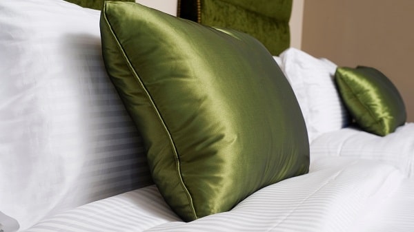
Red In Bedrooms
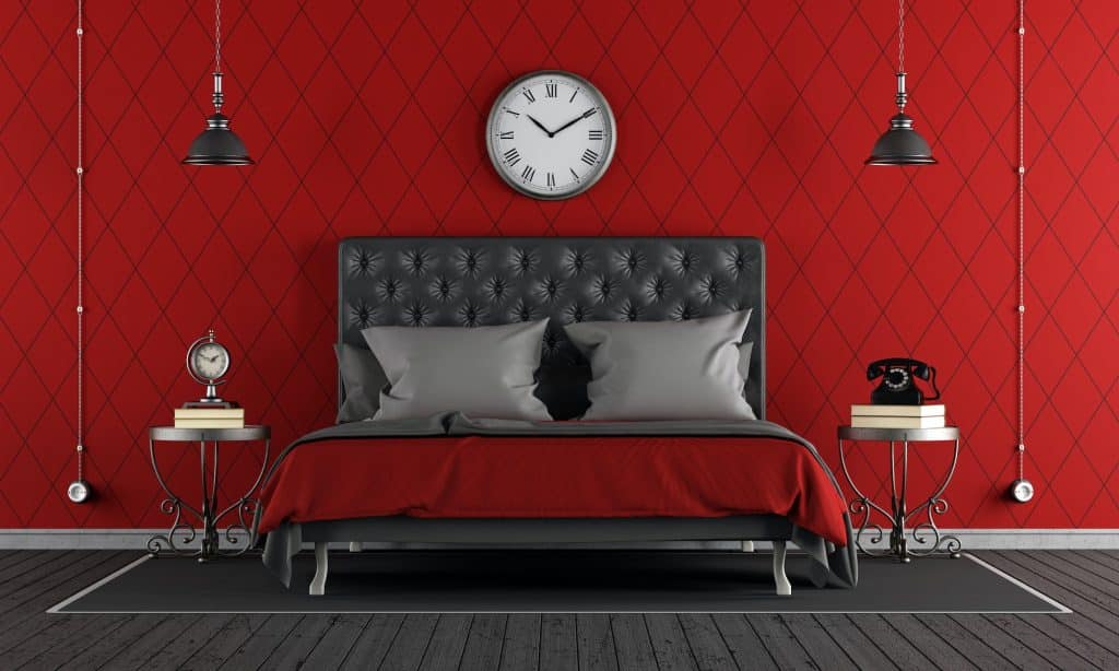
Red, often associated with passion and energy, can be a stimulating color. In a bedroom, where relaxation and rest are paramount, this stimulation may lead to restlessness. The vibrant nature of red can keep the mind active, hindering the ability to wind down and fall asleep. While a touch of red might add warmth, an overuse can create an environment that’s counterproductive to rest.
Instead of bright red, consider using softer shades like coral or pink, which can still add warmth without the stimulating effect. Alternatively, calming colors like blue or green might be more suitable for a bedroom, promoting relaxation and sleep. Personal preferences and the overall design theme should guide the color choice, ensuring that the bedroom remains a sanctuary for rest and rejuvenation.
Dark Brown In Living Spaces
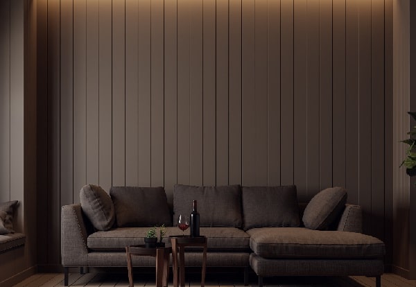
Dark brown, although rich and earthy, can have a dulling effect on living spaces. Its heaviness can make rooms feel smaller and more enclosed, stifling the sense of openness that many seek in communal areas. Particularly in spaces with limited natural light, dark brown can absorb illumination, creating a gloomy atmosphere that may not be inviting for family gatherings or social events.
To counteract the potential drawbacks of dark brown, consider using it sparingly or in combination with lighter shades. Complementary colors like cream or beige can balance the richness of brown, creating a cozy yet open feel. Accents of dark brown in furniture or accessories, rather than wall color, can also provide depth and character without overwhelming the space.
Bright Yellow In Kitchens

Bright yellow, with its sunny and cheerful appearance, might seem like an ideal choice for kitchens. However, its overwhelming brightness can cause eye strain, particularly under artificial lighting. The intensity of bright yellow can dominate the space, overshadowing other design elements and creating an imbalance. While it may evoke a sense of energy, it can also become tiring to the eyes over time.
Softer shades of yellow, such as lemon or buttercream, can still bring warmth and cheerfulness to a kitchen without the harshness of bright yellow. Accenting with yellow in smaller areas or accessories can also provide a pop of color without overwhelming the senses. Consideration of the overall design, lighting, and personal taste can lead to a more harmonious and comfortable kitchen environment.
Neon Colors In Home Offices

Neon colors, with their vibrant and electric hues, can be visually exciting but may not be suitable for a home office. These intense colors can create a sense of energy but may also lead to distraction and hinder focus. In a workspace where concentration and productivity are key, neon colors can be more of a hindrance than a help. The visual stimulation they provide might be more suitable for creative spaces but can be overwhelming in an office setting.
For a more conducive work environment, consider using neutral or muted colors that promote focus and calm. Shades of blue, green, or even soft grays can create a serene atmosphere that supports concentration. If a touch of vibrancy is desired, small accents or accessories in brighter colors can add character without disrupting the overall sense of calm in the workspace.
Black In Bathrooms
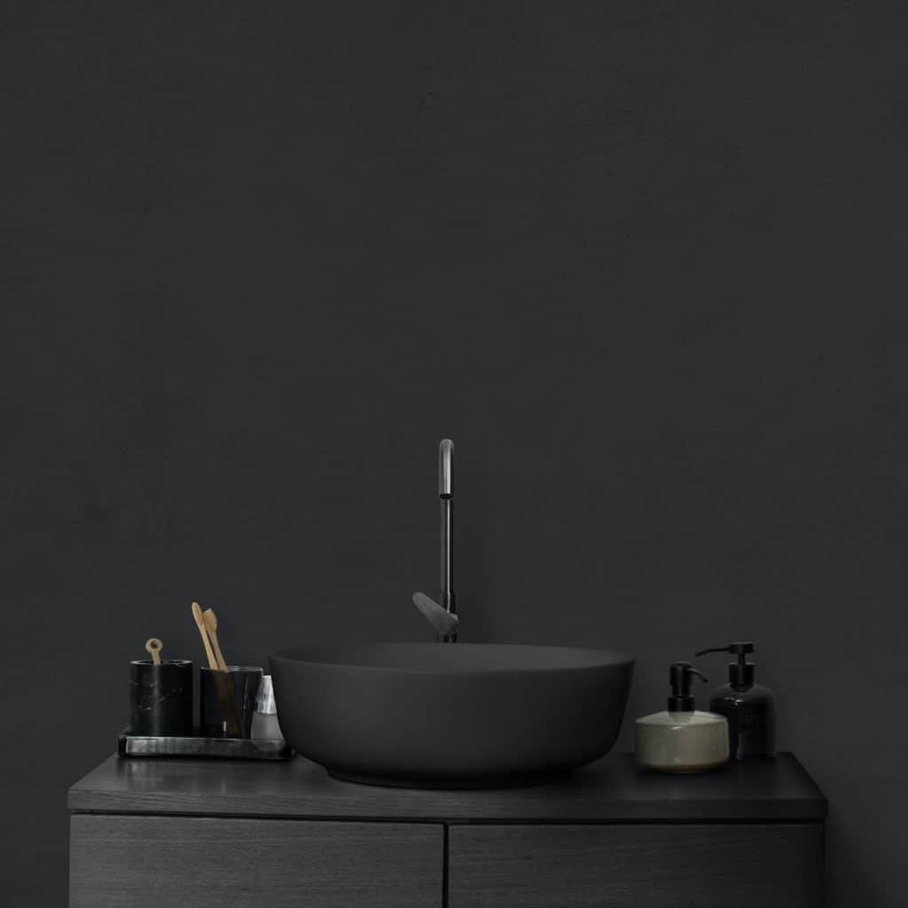
Black can be a bold and elegant choice, but using it in bathrooms might present practical challenges. Its dark surface can show water spots, fingerprints, and stains more readily, making maintenance more demanding. While black can add a touch of sophistication, it may also make a bathroom feel smaller and less inviting. The association of cleanliness with lighter colors might make black an unappealing choice for this particular space.
If the allure of black is strong, consider using it in combination with lighter colors or as an accent rather than the main hue. Black fixtures, tiles, or accessories can add elegance without overwhelming the space. Pairing black with white or other light shades can create a balanced and stylish look that maintains a sense of cleanliness and openness in the bathroom.
White In Children’s Rooms
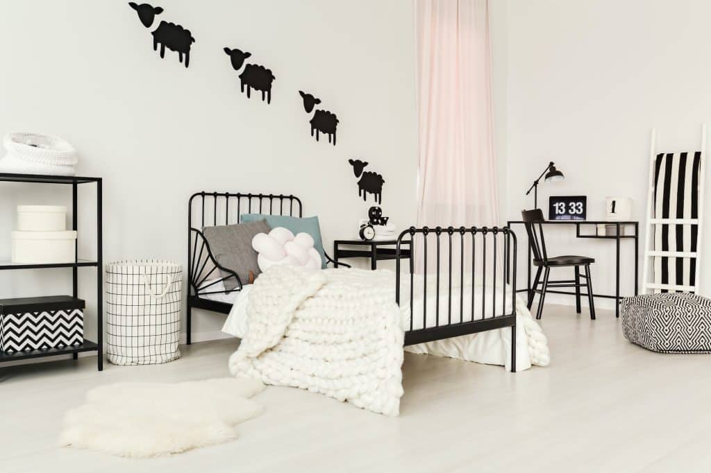
White is often associated with purity and simplicity, but it may not be the best choice for children’s rooms. Its pristine appearance can easily show dirt, marks, and scribbles, making it a high-maintenance option for a space that should encourage creativity and play. While white can create a sense of spaciousness, it may lack the warmth and stimulation that children’s environments often benefit from.
Consider using more playful yet practical colors in children’s rooms. Pastels, bright hues, or even patterns can add visual interest and stimulate creativity without the maintenance challenges of white. Choosing washable paints or incorporating white in areas less prone to wear and tear can still allow for a fresh and open feel without the impracticality.
Gray In Dining Rooms
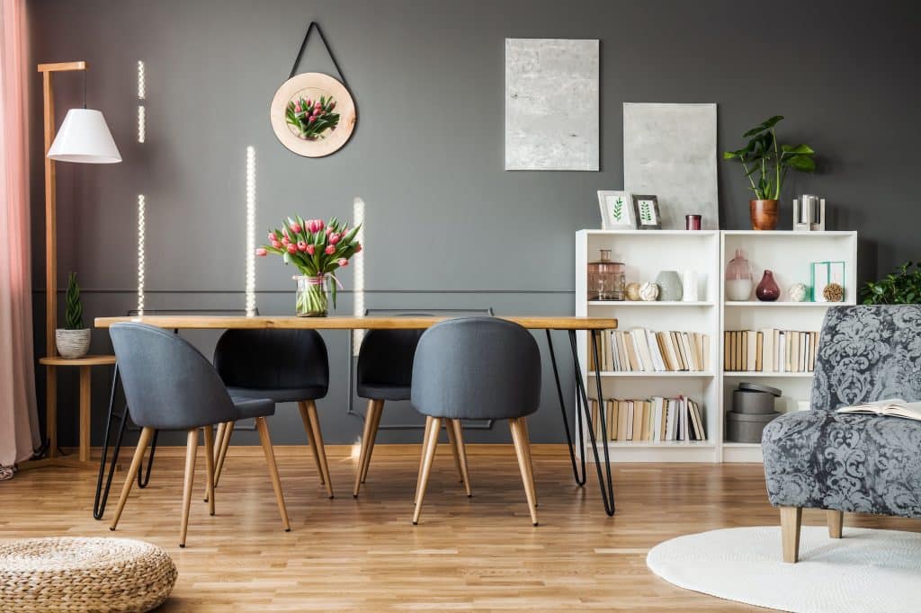
Gray, with its neutral and versatile nature, might seem like a safe choice, but in dining rooms, it can have an appetite-suppressing effect. Its cool and sometimes somber tones may not create the warm and inviting atmosphere that dining spaces often seek. While elegant and contemporary, gray might not evoke the sense of comfort and enjoyment associated with communal eating.
To create a more appetizing environment, consider using warmer shades or more inviting colors in the dining room. Earth tones, soft yellows, or even rich reds can enhance the dining experience, promoting conversation and enjoyment. If gray is a preferred color, pairing it with wood tones or warmer accents can balance its coolness, creating a more welcoming dining space.
Orange In Relaxation Areas
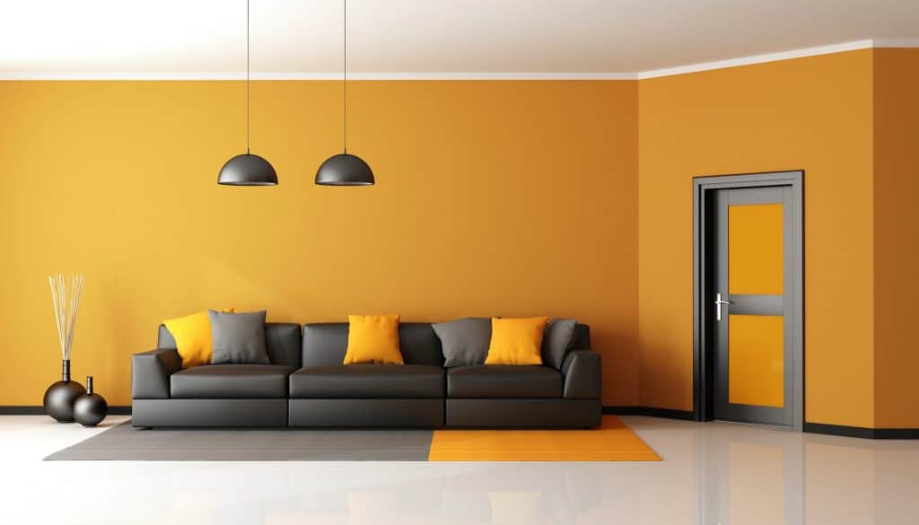
Orange, known for its energetic and vibrant nature, may not be the best choice for relaxation areas in the home. Its lively hue can stimulate the senses rather than calm them, potentially disrupting the serene environment needed for relaxation or meditation. While it may bring warmth and cheerfulness, orange might not promote the tranquility often sought in spaces dedicated to rest and reflection.
For a more calming effect, consider using shades of blue or green, which are often associated with peace and relaxation. These colors can create a soothing atmosphere that encourages unwinding and mindfulness. If a touch of warmth is desired, softer shades of orange or complementary colors can be used in accents or accessories without disturbing the overall sense of calm.
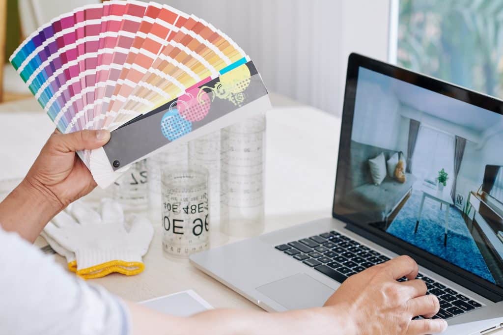
Find Color Harmony in Your Home!
Selecting the right colors for a home is more than just a matter of personal taste; it requires thoughtful consideration of the function and feel of each space. The guidance provided in this post aims to help you avoid common color pitfalls and make informed decisions that resonate with their lifestyle and aesthetic preferences. Remember, while these guidelines are useful, consulting with a design professional or experimenting with color tools can provide personalized insights, ensuring that the chosen colors truly enhance the comfort, appeal, and functionality of your home.