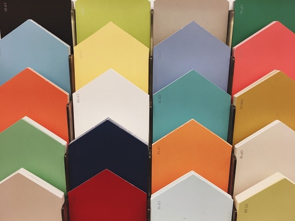
Colors are not just sensations on the eye; they are emotions and manner of everything that exists and more. Every year, professionals worldwide come together and predict a few color palettes, communicating the consumer’s current mood and precisely representing their emotions. The latest technology, design, pop culture, and fashion industry trends also significantly influence these color trends.
As 2020 comes to an end, strategies and predictions have already started to build up, bringing in new shades to dye 2021 with hope and many fresh starts. Let’s take a look at the early predictions and the emotions they convey.
Passionate by HGTV Home – Sherwin-Williams
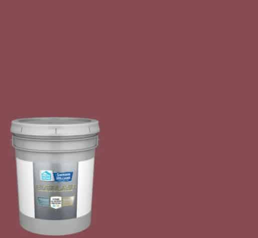
According to the HGTV home predictions by Sherwin Williams, the coming year will witness a hike in vibrant, spirited, and daring colored themes. The saturated robust red is labeled Passionate HGSW2032 and part of their 2021 Delightfully Daring Color Collection (10-shades), a bold and nature-inspired palette (exclusively available at Lowe’s).
This revitalizing berry-red shade brings you a mix of modern and traditional, working exceptionally well against neutral color furniture or only as an accent wall. You can also pair it with other striking shades from the collection like classic blue (Long horizon) or the verdant green(Cloverfields) and be fierce after a year of dullness.
Ultimate Gray & Illuminating By Pantone

Pantone Color Institute (The global color authority), putting an end to all our anticipations, declared their contrasting 2021 colors of the year in press releases: the ultimate gray ( functional and reliable neutral) and illuminating (yellow hue, reflecting resiliency and optimism).
Leatrice Eiseman (executive director of Pantone) says, “The union of ultimate gray with the spirited yellow illuminating conveys a message of positivity supported by fortitude.” Ultimate gray is an evergreen choice of tone as wall paint or for furniture. While illuminating signifies positivity and radiance when employed on accessories, accent furniture, and doors. The contrast of these two independent colors conveys a message which is both uplifting and stable.