
Color plays a vital role in interior design, influencing both the aesthetics and the mood of a space. While some colors can enhance the ambiance, others may have unintended effects. Common misconceptions about color choices often lead to mistakes that can affect the comfort and appeal of a home. This post is here to shed light on specific colors that may not be suitable for various rooms in your home, guiding you toward choices that resonate with your lifestyle and preferences.
How Color Affects Your Mood
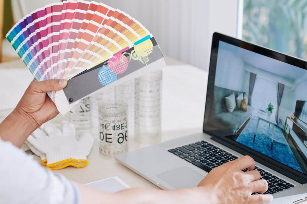
Color is more than a visual element; it has a profound impact on human emotions and psychology. Different colors can evoke various feelings and moods, influencing how a space is perceived and experienced. For example, blues and greens are often associated with calmness and serenity, while reds and oranges may stimulate energy and excitement. Understanding the psychological effects of color is essential in interior design, as it allows for the creation of spaces that align with the desired ambiance and function.
The influence of color on mood is not merely subjective; scientific studies have explored the connection between color and emotional response. Lighter shades tend to promote feelings of openness and relaxation, while darker colors can create a sense of coziness or, in some cases, confinement. The intensity and saturation of a color also play a role, with bright, bold hues often energizing a space, and muted tones providing a more soothing effect. Even the direction of a room and the natural light it receives can alter the perception of color, making the selection process a complex but rewarding endeavor. Now, let’s look at a few color choices that may not be ideal for certain spaces.
Red In Bedrooms
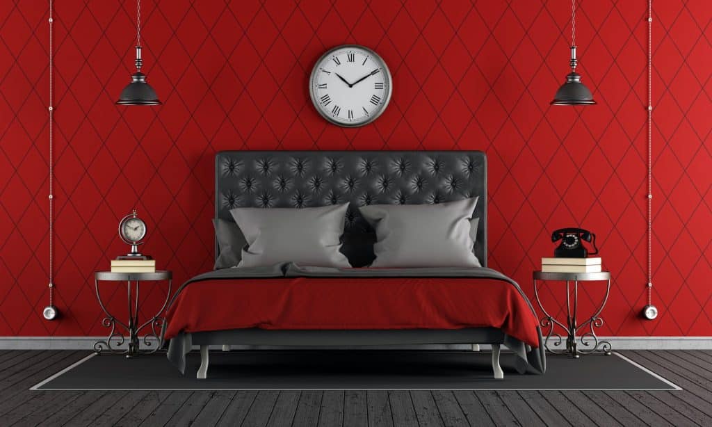
Red, often associated with passion and energy, can be a stimulating color. In a bedroom, where relaxation and rest are paramount, this stimulation may lead to restlessness. The vibrant nature of red can keep the mind active, hindering the ability to wind down and fall asleep. While a touch of red might add warmth, an overuse can create an environment that’s counterproductive to rest.
Instead of bright red, consider using softer shades like coral or pink, which can still add warmth without the stimulating effect. Alternatively, calming colors like blue or green might be more suitable for a bedroom, promoting relaxation and sleep. Personal preferences and the overall design theme should guide the color choice, ensuring that the bedroom remains a sanctuary for rest and rejuvenation.
Dark Brown In Living Spaces
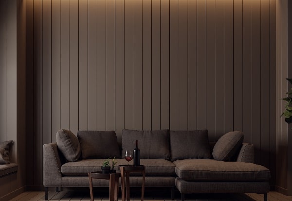
Dark brown, although rich and earthy, can have a dulling effect on living spaces. Its heaviness can make rooms feel smaller and more enclosed, stifling the sense of openness that many seek in communal areas. Particularly in spaces with limited natural light, dark brown can absorb illumination, creating a gloomy atmosphere that may not be inviting for family gatherings or social events.
To counteract the potential drawbacks of dark brown, consider using it sparingly or in combination with lighter shades. Complementary colors like cream or beige can balance the richness of brown, creating a cozy yet open feel. Accents of dark brown in furniture or accessories, rather than wall color, can also provide depth and character without overwhelming the space.
Bright Yellow In Kitchens
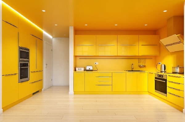
Bright yellow, with its sunny and cheerful appearance, might seem like an ideal choice for kitchens. However, its overwhelming brightness can cause eye strain, particularly under artificial lighting. The intensity of bright yellow can dominate the space, overshadowing other design elements and creating an imbalance. While it may evoke a sense of energy, it can also become tiring to the eyes over time.
Softer shades of yellow, such as lemon or buttercream, can still bring warmth and cheerfulness to a kitchen without the harshness of bright yellow. Accenting with yellow in smaller areas or accessories can also provide a pop of color without overwhelming the senses. Consideration of the overall design, lighting, and personal taste can lead to a more harmonious and comfortable kitchen environment.
I love Gray with cool undertones it looks smashing in my Home with Black and Mirror accents ..one must know the undertones to carry it off …..
Gray soothes and comforts me. Painted the whole house a very soft gray. Love it and definitely not a mistake.
Sherwin Williams’ Colonnade Grey is just beautiful.
Check it out…
I agree with the gray lovers! It’s so easy to decorate with; either leave it neutral or spice it up with just about any color I can think of.