Skip to content

Worst Colors For Interior Paint And Why

    Walking into a room and feeling overwhelmed or anxious might have more to do with the interior paint colors than you’d expect. The hues that surround you can significantly influence your mood, perception of space, and even your well-being. In this post, you’ll learn about the colors that experts and psychologists often consider poor choices for interior paint. The goal is to help you make informed decisions that contribute to a comfortable and inviting home environment.

    The Emotional Impact Of Wall Colors

    Interior Paint

    Colors wield a powerful influence over human emotions and overall well-being. The shades of blue that often bring a sense of tranquility contrast sharply with vibrant reds known for their energizing effects. However, these psychological impacts are not universal. Factors such as cultural background, personal experiences, and even your current emotional state can alter how a color affects you.

    Understanding the emotional weight of colors is crucial when selecting the perfect shade for your walls. This knowledge serves as the foundation for the rest of this discussion, setting the stage for a deep dive into specific colors that could turn your home into an uncomfortable space. Knowing what to avoid can be just as important as knowing what to include in your interior design plans.

    Neon Colors: A Visual Assault

    Interior Paint

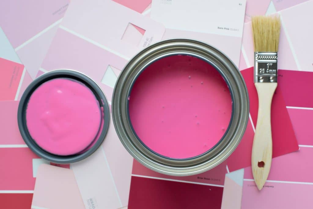
    Neon colors like bright pink, electric blue, and lime green can be visually overwhelming. These shades tend to dominate a space, leaving little room for visual rest. They can also lead to eye strain over time, especially in rooms where you spend a significant amount of time, such as a home office or living room.

    The impact of neon colors extends beyond just visual discomfort. Psychologically, these colors can induce feelings of restlessness or even anxiety. They are often too stimulating to promote relaxation or focus, making them poor choices for most interior spaces. The key is to use these colors sparingly, if at all, and to consider the mood you want to create in each room.

    The Cave Effect: Dark Browns And Blacks

    Interior Paint

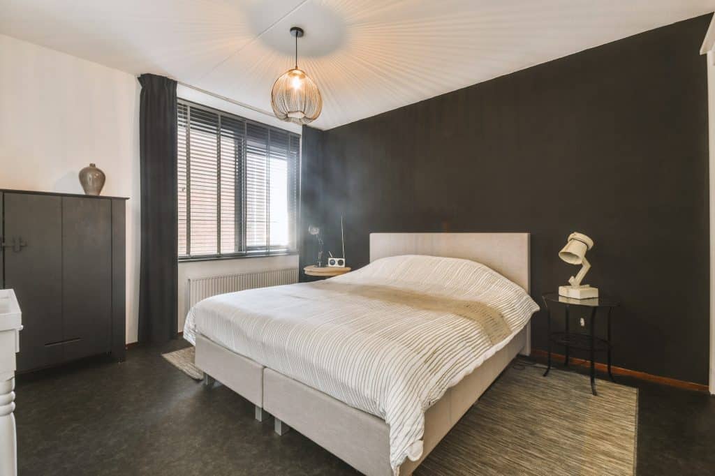
    Dark colors like brown and black can make a room feel smaller and more confined. These shades absorb light, reducing the sense of space and making rooms feel more like caves than open areas. This can be particularly problematic in smaller rooms or spaces without much natural light.

    The psychological impact of these dark colors can be equally troubling. They can induce feelings of being trapped or confined, which is not the atmosphere most people want in their homes. While dark colors might seem cozy or sophisticated at first glance, they often contribute to a more oppressive environment. Therefore, it’s advisable to use these colors cautiously and to balance them with lighter shades.

    The Blues: Not Always Calming

    Interior Paint

    Blue is often touted as a calming, serene color, ideal for bedrooms and bathrooms. However, not all shades of blue evoke these peaceful feelings. Darker or more intense blues can create a sense of sadness or even coldness, making them less than ideal for living spaces where warmth and comfort are desired.

    The importance of shade and tone cannot be overstated when it comes to blue. While a soft sky blue might be perfect for a bedroom, a deep navy blue could make the same space feel more like a gloomy underwater scene. Therefore, it’s crucial to consider the specific shade and how it fits into the overall design and mood you’re aiming to create.

    The Gray Area: Why It’s Not Always Neutral

    Interior Paint

    Gray is often considered a safe, neutral color that can fit into almost any interior design scheme. However, this is a misconception. Depending on the shade, gray can evoke feelings of dreariness, sadness, or even monotony. It’s a color that can easily make a room feel like it’s lacking in energy.

    The challenge with gray is that it’s not as emotionally neutral as people think. In darker shades, it can even feel oppressive, much like the dark browns and blacks discussed earlier. If you’re considering gray, it’s essential to think about the room’s purpose and how much natural light it receives. Pairing gray with more vibrant colors can also help offset its potential downsides.

    Red Alert: The Color Of Caution

    Interior Paint

    Red is a color that naturally draws attention. It’s associated with love and passion but also with urgency and caution. While it might seem like a good idea to use red to create a lively and energetic space, too much red can be overwhelming. It can evoke feelings of urgency or even aggression, which are generally not the emotions one wants to feel at home.

    Interestingly, red has been shown to have an impact on appetite and stress levels. Some restaurants use red to stimulate appetite, but in a home setting, particularly in a dining room or kitchen, this might not be the desired effect. Therefore, if you’re thinking of using red, it’s advisable to use it sparingly and to consider the specific emotional impact you want to achieve.

    Sickly Greens: The Hospital Hue

    Interior Paint

    Certain shades of green, particularly those that are pale or overly bright, are often associated with illness or a clinical setting. Think of the stereotypical hospital green that is supposed to be calming but often ends up feeling quite the opposite. These shades can make a room feel sterile and unwelcoming, rather than fresh and vibrant.

    The role of context and shade is crucial when it comes to green. While forest or sage greens can evoke feelings of tranquility and connection with nature, neon or pale greens can have the opposite effect. If you’re considering using green, it’s essential to choose a shade that not only complements your decor but also promotes the kind of atmosphere you want to create.

    The Final Brushstroke: Choose Wisely

    Selecting the right paint color for your home is more than just an aesthetic choice; it’s an emotional one, too. From the anxiety-inducing impact of neon colors to the oppressive feel of dark browns, the wrong hue can turn your sanctuary into a stress zone. So, before you dip that paintbrush, consider the psychological and emotional effects of your color choices. Your home should be a haven, and the right colors can make all the difference!