The Blues: Not Always Calming
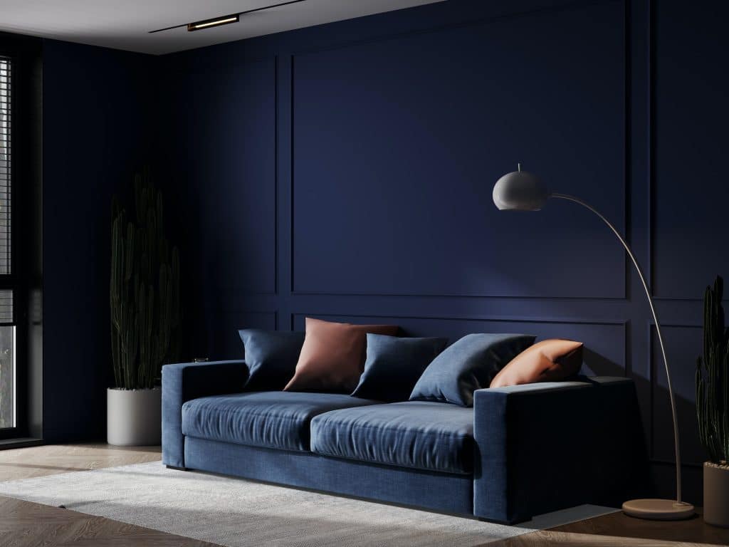
Blue is often touted as a calming, serene color, ideal for bedrooms and bathrooms. However, not all shades of blue evoke these peaceful feelings. Darker or more intense blues can create a sense of sadness or even coldness, making them less than ideal for living spaces where warmth and comfort are desired.
The importance of shade and tone cannot be overstated when it comes to blue. While a soft sky blue might be perfect for a bedroom, a deep navy blue could make the same space feel more like a gloomy underwater scene. Therefore, it’s crucial to consider the specific shade and how it fits into the overall design and mood you’re aiming to create.
The Gray Area: Why It’s Not Always Neutral

Gray is often considered a safe, neutral color that can fit into almost any interior design scheme. However, this is a misconception. Depending on the shade, gray can evoke feelings of dreariness, sadness, or even monotony. It’s a color that can easily make a room feel like it’s lacking in energy.
The challenge with gray is that it’s not as emotionally neutral as people think. In darker shades, it can even feel oppressive, much like the dark browns and blacks discussed earlier. If you’re considering gray, it’s essential to think about the room’s purpose and how much natural light it receives. Pairing gray with more vibrant colors can also help offset its potential downsides.
Red Alert: The Color Of Caution
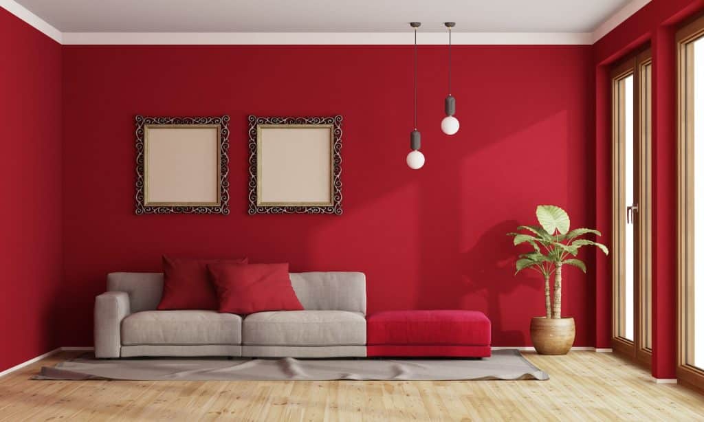
Red is a color that naturally draws attention. It’s associated with love and passion but also with urgency and caution. While it might seem like a good idea to use red to create a lively and energetic space, too much red can be overwhelming. It can evoke feelings of urgency or even aggression, which are generally not the emotions one wants to feel at home.
Interestingly, red has been shown to have an impact on appetite and stress levels. Some restaurants use red to stimulate appetite, but in a home setting, particularly in a dining room or kitchen, this might not be the desired effect. Therefore, if you’re thinking of using red, it’s advisable to use it sparingly and to consider the specific emotional impact you want to achieve.
Sickly Greens: The Hospital Hue

Certain shades of green, particularly those that are pale or overly bright, are often associated with illness or a clinical setting. Think of the stereotypical hospital green that is supposed to be calming but often ends up feeling quite the opposite. These shades can make a room feel sterile and unwelcoming, rather than fresh and vibrant.
The role of context and shade is crucial when it comes to green. While forest or sage greens can evoke feelings of tranquility and connection with nature, neon or pale greens can have the opposite effect. If you’re considering using green, it’s essential to choose a shade that not only complements your decor but also promotes the kind of atmosphere you want to create.
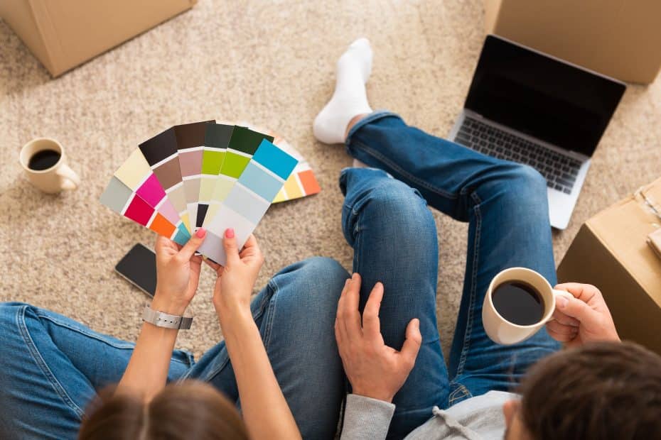
The Final Brushstroke: Choose Wisely
Selecting the right paint color for your home is more than just an aesthetic choice; it’s an emotional one, too. From the anxiety-inducing impact of neon colors to the oppressive feel of dark browns, the wrong hue can turn your sanctuary into a stress zone. So, before you dip that paintbrush, consider the psychological and emotional effects of your color choices. Your home should be a haven, and the right colors can make all the difference!