
Neon Colors In Home Offices

Neon colors, with their vibrant and electric hues, can be visually exciting but may not be suitable for a home office. These intense colors can create a sense of energy but may also lead to distraction and hinder focus. In a workspace where concentration and productivity are key, neon colors can be more of a hindrance than a help. The visual stimulation they provide might be more suitable for creative spaces but can be overwhelming in an office setting.
For a more conducive work environment, consider using neutral or muted colors that promote focus and calm. Shades of blue, green, or even soft grays can create a serene atmosphere that supports concentration. If a touch of vibrancy is desired, small accents or accessories in brighter colors can add character without disrupting the overall sense of calm in the workspace.
Black In Bathrooms
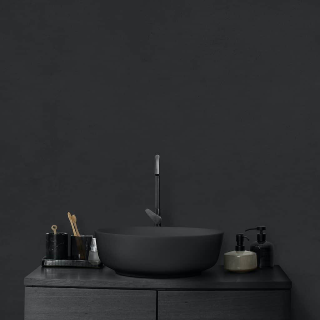
Black can be a bold and elegant choice, but using it in bathrooms might present practical challenges. Its dark surface can show water spots, fingerprints, and stains more readily, making maintenance more demanding. While black can add a touch of sophistication, it may also make a bathroom feel smaller and less inviting. The association of cleanliness with lighter colors might make black an unappealing choice for this particular space.
If the allure of black is strong, consider using it in combination with lighter colors or as an accent rather than the main hue. Black fixtures, tiles, or accessories can add elegance without overwhelming the space. Pairing black with white or other light shades can create a balanced and stylish look that maintains a sense of cleanliness and openness in the bathroom.
White In Children’s Rooms
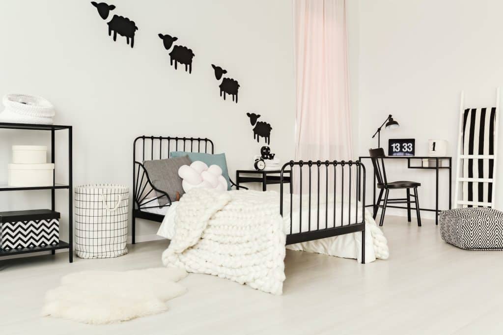
White is often associated with purity and simplicity, but it may not be the best choice for children’s rooms. Its pristine appearance can easily show dirt, marks, and scribbles, making it a high-maintenance option for a space that should encourage creativity and play. While white can create a sense of spaciousness, it may lack the warmth and stimulation that children’s environments often benefit from.
Consider using more playful yet practical colors in children’s rooms. Pastels, bright hues, or even patterns can add visual interest and stimulate creativity without the maintenance challenges of white. Choosing washable paints or incorporating white in areas less prone to wear and tear can still allow for a fresh and open feel without the impracticality.
Gray In Dining Rooms
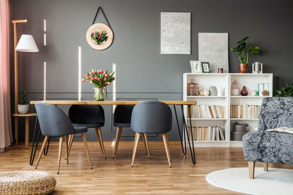
Gray, with its neutral and versatile nature, might seem like a safe choice, but in dining rooms, it can have an appetite-suppressing effect. Its cool and sometimes somber tones may not create the warm and inviting atmosphere that dining spaces often seek. While elegant and contemporary, gray might not evoke the sense of comfort and enjoyment associated with communal eating.
To create a more appetizing environment, consider using warmer shades or more inviting colors in the dining room. Earth tones, soft yellows, or even rich reds can enhance the dining experience, promoting conversation and enjoyment. If gray is a preferred color, pairing it with wood tones or warmer accents can balance its coolness, creating a more welcoming dining space.
Orange In Relaxation Areas
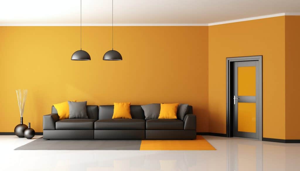
Orange, known for its energetic and vibrant nature, may not be the best choice for relaxation areas in the home. Its lively hue can stimulate the senses rather than calm them, potentially disrupting the serene environment needed for relaxation or meditation. While it may bring warmth and cheerfulness, orange might not promote the tranquility often sought in spaces dedicated to rest and reflection.
For a more calming effect, consider using shades of blue or green, which are often associated with peace and relaxation. These colors can create a soothing atmosphere that encourages unwinding and mindfulness. If a touch of warmth is desired, softer shades of orange or complementary colors can be used in accents or accessories without disturbing the overall sense of calm.
Find Color Harmony in Your Home!
Selecting the right colors for a home is more than just a matter of personal taste; it requires thoughtful consideration of the function and feel of each space. The guidance provided in this post aims to help you avoid common color pitfalls and make informed decisions that resonate with their lifestyle and aesthetic preferences. Remember, while these guidelines are useful, consulting with a design professional or experimenting with color tools can provide personalized insights, ensuring that the chosen colors truly enhance the comfort, appeal, and functionality of your home.
I love Gray with cool undertones it looks smashing in my Home with Black and Mirror accents ..one must know the undertones to carry it off …..
Gray soothes and comforts me. Painted the whole house a very soft gray. Love it and definitely not a mistake.
Sherwin Williams’ Colonnade Grey is just beautiful.
Check it out…
I agree with the gray lovers! It’s so easy to decorate with; either leave it neutral or spice it up with just about any color I can think of.